
Making data entry convenient for all users.
Minnowtech App
IOS/Android • User Interface • Wireframes • Prototyping
Problem Statement
Minnowtech’s biomass assessment system relied on weekly manual data entry from shrimp farmers. During beta testing, missed or late entries led to inconsistent data, reducing the accuracy of biomass readings and undermining decision-making for farm operators.
The issue was not technical failure—it was human friction.
Goal
Design a lightweight mobile application that:
Encourages consistent weekly data entry
Reduces missed or late submissions
Operates reliably in remote, low-connectivity environments
The goal was to improve data reliability without increasing cognitive load for busy, non-technical users.
Role: Solo UX Researcher & UX Designer
Timeline: July 2023 – August 2023
Company: Minnowtech (Aquaculture Technology, B2B)
My Role & Ownership
As the sole UX designer, I owned:
UX strategy and interaction design
Visual design and motion
Prototyping and design validation
Close collaboration with engineering during beta
This was a supporting product designed to strengthen an existing hardware + software ecosystem.
UX Challenge
During beta testing across two major farm sites (Hawaii and Ecuador), Minnowtech identified a recurring issue:
users frequently forgot to log weekly shrimp data, resulting in gaps that compromised biomass accuracy.
Shrimp farmers—often operating in physically demanding, time-sensitive environments—did not consistently engage with the existing system unless prompted.
The challenge was to:
Improve compliance without adding complexity
Support users across languages, regions, and connectivity constraints
Keep the experience fast, intuitive, and non-intrusive
Key Design Decisions
1. Reminders as the Core Feature (Not an Add-On)
Tradeoff: Add features vs. solve the real problem.
Decision: Center the app entirely around reminders and data entry—no dashboards, analytics, or secondary tasks.
2. Escalating Notifications, Not Punitive Alerts
Tradeoff: Accountability vs. user frustration.
Decision: Use gentle weekly reminders that escalate to daily notifications only when entries are overdue, maintaining urgency without alienation.
3. Visual-First UX Over Text
Tradeoff: Text clarity vs. global accessibility.
Decision: Rely on icons, indicators, and visual cues to reduce language dependence and support global users.
4. Fastest Path to Completion
Tradeoff: Rich onboarding vs. efficiency.
Decision: Design a direct path from app launch → data entry → confirmation, minimizing steps for busy users.
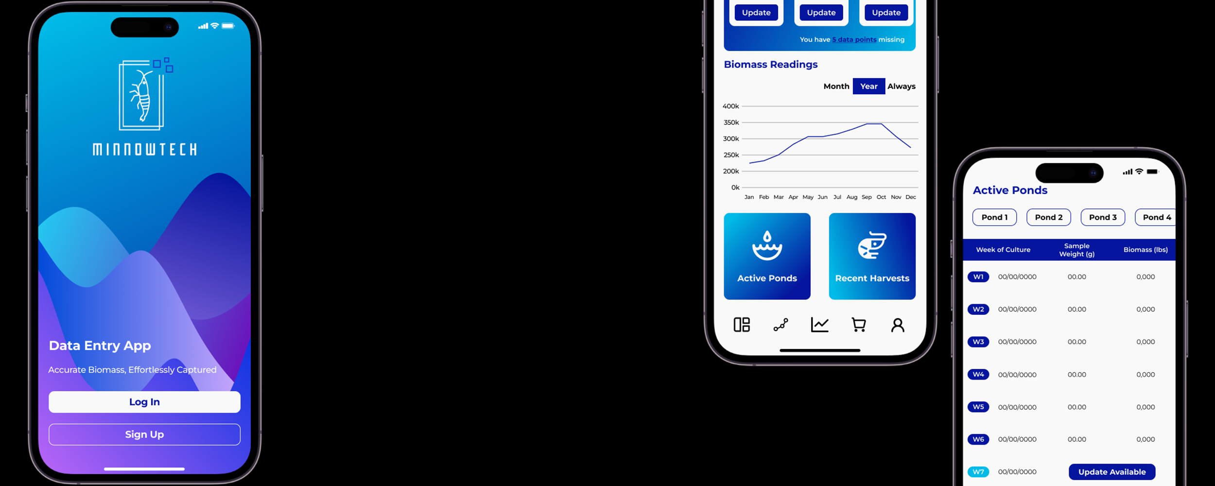
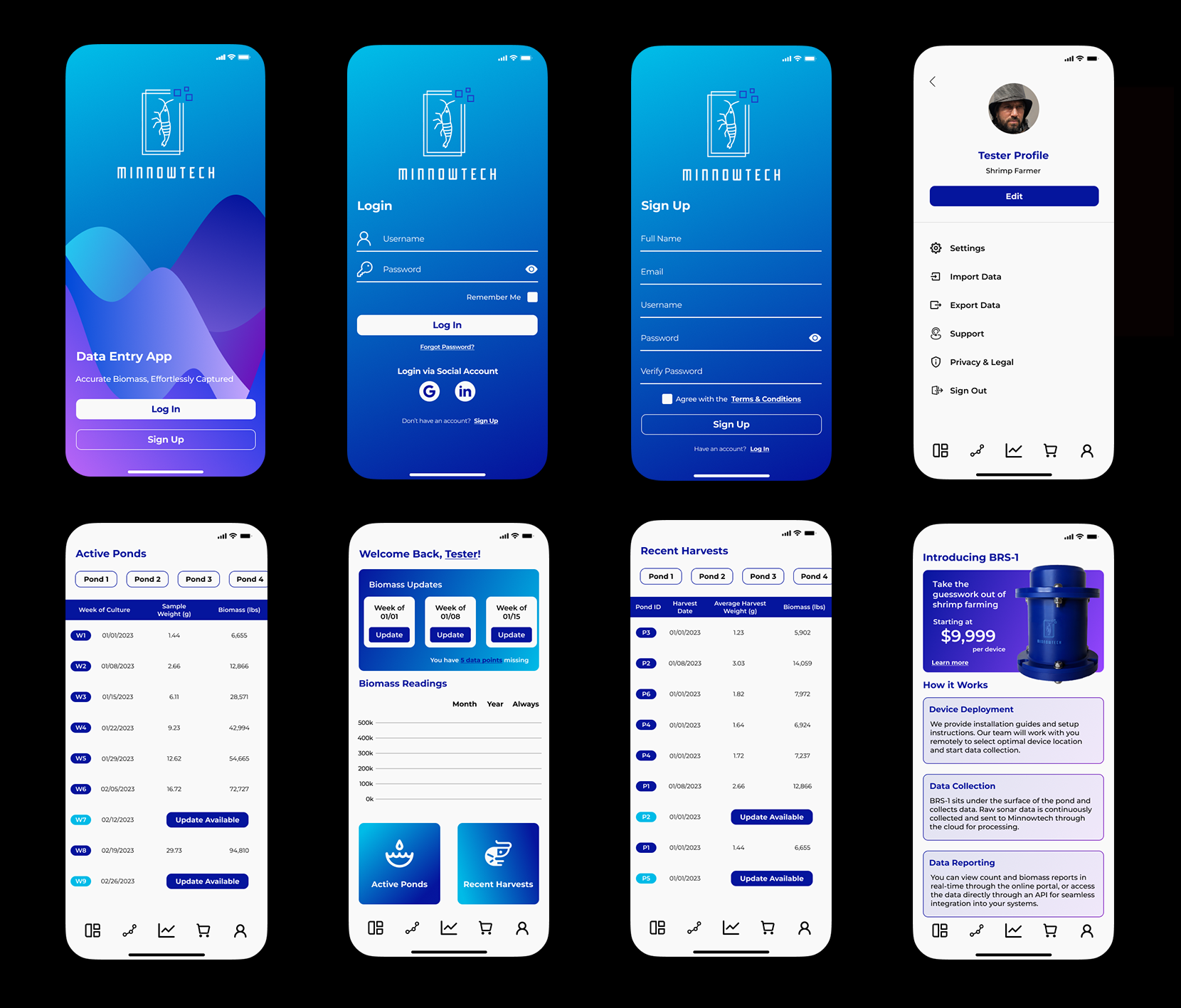
Design Solution
I designed a mobile-first data entry application that integrates seamlessly with Minnowtech’s existing system.
Core Features
Weekly and overdue push notifications
Clear indicators for missing data
Streamlined data entry flow
Minimalist UI optimized for speed and clarity
Visual Design
Preserved Minnowtech’s brand identity while refining the color palette
Introduced a custom background gradient to elevate the minimalist interface
Selected familiar, high-legibility typography to ensure ease of use
Designed for consistency across devices and environments
The visual system supported clarity, trust, and usability without distracting from the app’s primary function.
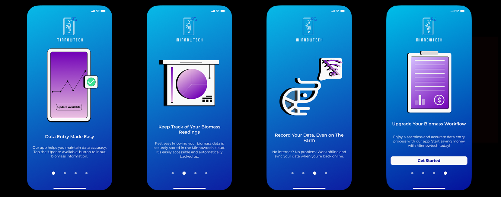
Getting Started Guide
Outcome & Impact
Improved consistency of weekly data submissions during beta
Reduced missed entries caused by forgetfulness
Increased reliability of biomass assessments
Strengthened the overall value of Minnowtech’s hardware + software ecosystem
Impact (Directional):
Higher data completeness across test sites
Reduced manual follow-up required from internal teams
Increased confidence in system-generated insights.
Mobile Slides
What This Case Study Demonstrates
Designing for behavior change, not just interfaces
Strong judgment in scope control and prioritization
Ability to design for global, non-technical users
Experience building UX for low-connectivity, real-world environments
Translating academic/technical systems into practical tools
What I Learned
How to design technology that works across languages, cultures, and geographies
The importance of simplicity when designing for physically demanding workflows
How UX can meaningfully improve data quality—not by enforcing rules, but by supporting users