
Changing the way our revenue is made.
Materic E-Commerce System
UX Research • User Interface • Wireframes • Information Architecture • Prototypes
Problem Statement
Problem: Materic’s sales process was built for long-term contracts, not urgent or self-serve purchases. Customers could not browse products, access technical specifications clearly, or request quotes online without entering a multi-call sales pipeline. This friction caused lost leads, delayed purchasing, and poor digital conversion—especially for time-sensitive buyers.
Goal: Design and launch a self-service e-commerce experience that allows users to:
Discover materials quickly
Evaluate complex technical specs independently
Request quotes or purchase without sales intervention
Success meant reducing sales friction while preserving technical depth and business trust.
Role
Solo UX Researcher · UX Designer · Digital Marketer
Company
Materic
Date
June 2023 - September 2023
My Role & Ownership
As the sole UX and marketing specialist, I owned the project end to end:
User research (interviews, surveys, lead analysis)
Information architecture & UX strategy
Visual design, motion, and prototyping
Lead-generation and funnel optimization
Cross-functional collaboration with engineers and commercial leadership
This was a 0→1 product initiative with no existing e-commerce infrastructure.
Research & Key Insights
Methods
22 interviews with lost prospects (Q1–Q2 2023)
Follow-up survey (17 responses)
Analysis of inbound digital leads (Jan–July 2023)
Findings
60%+ of users abandoned due to sales process friction
Core pain points:
No online purchasing or instant quote capability
Confusing, sales-dependent workflows
Multiple calls with different stakeholders
32% of inbound leads explicitly requested instant quotes or online availability
Insight
Users were ready to buy—but the system required them to wait. The mismatch between urgency and process directly blocked conversion.
Key Design Decisions
1. Self-Service Without Oversimplification
Tradeoff: Reduce sales dependence without stripping technical depth.
Decision: Design product pages that prioritize scannable specs first, with deeper documentation accessible without leaving the flow.
2. Multiple Conversion Paths, Not a Single CTA
Tradeoff: Some users want to buy immediately; others need approval or validation.
Decision: Offer parallel actions—purchase, request quote, or contact—without forcing a single funnel.
3. Hierarchy Over Minimalism
Tradeoff: Clean UI vs. information density for academic users.
Decision: Favor clarity and hierarchy over minimal layouts, using typography, spacing, and sectioning to support dense content.
4. Sales as Support, Not a Gatekeeper
Tradeoff: Maintain sales relationships while removing bottlenecks.
Decision: Design the experience so sales becomes optional assistance, not a required step.
Design Solution
I designed a full e-commerce flow from scratch, including:
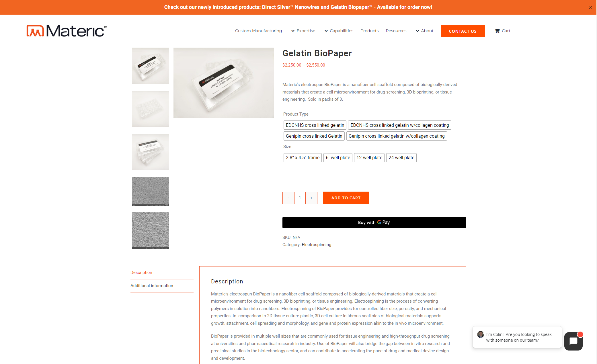
Product Catalog
Product Detail Pages
Cart
Checkout
Design Principles
Technical clarity for academic and research audiences
High-legibility typography for complex specifications
Brand-consistent visual system
Responsive layouts across devices
Clear progression from discovery → decision → action
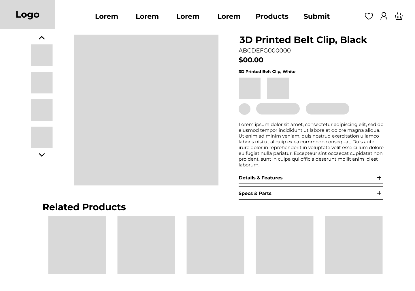
Low Fidelity Wireframe
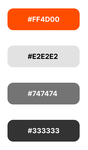
Color Palette
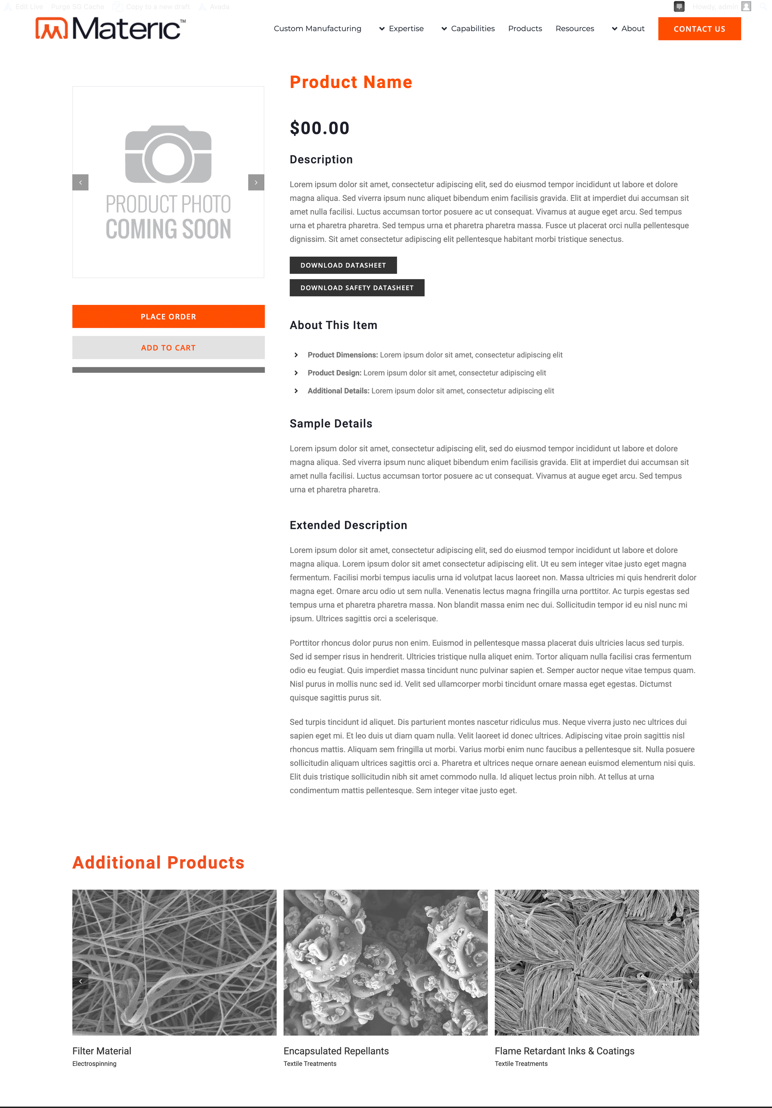
Prototype
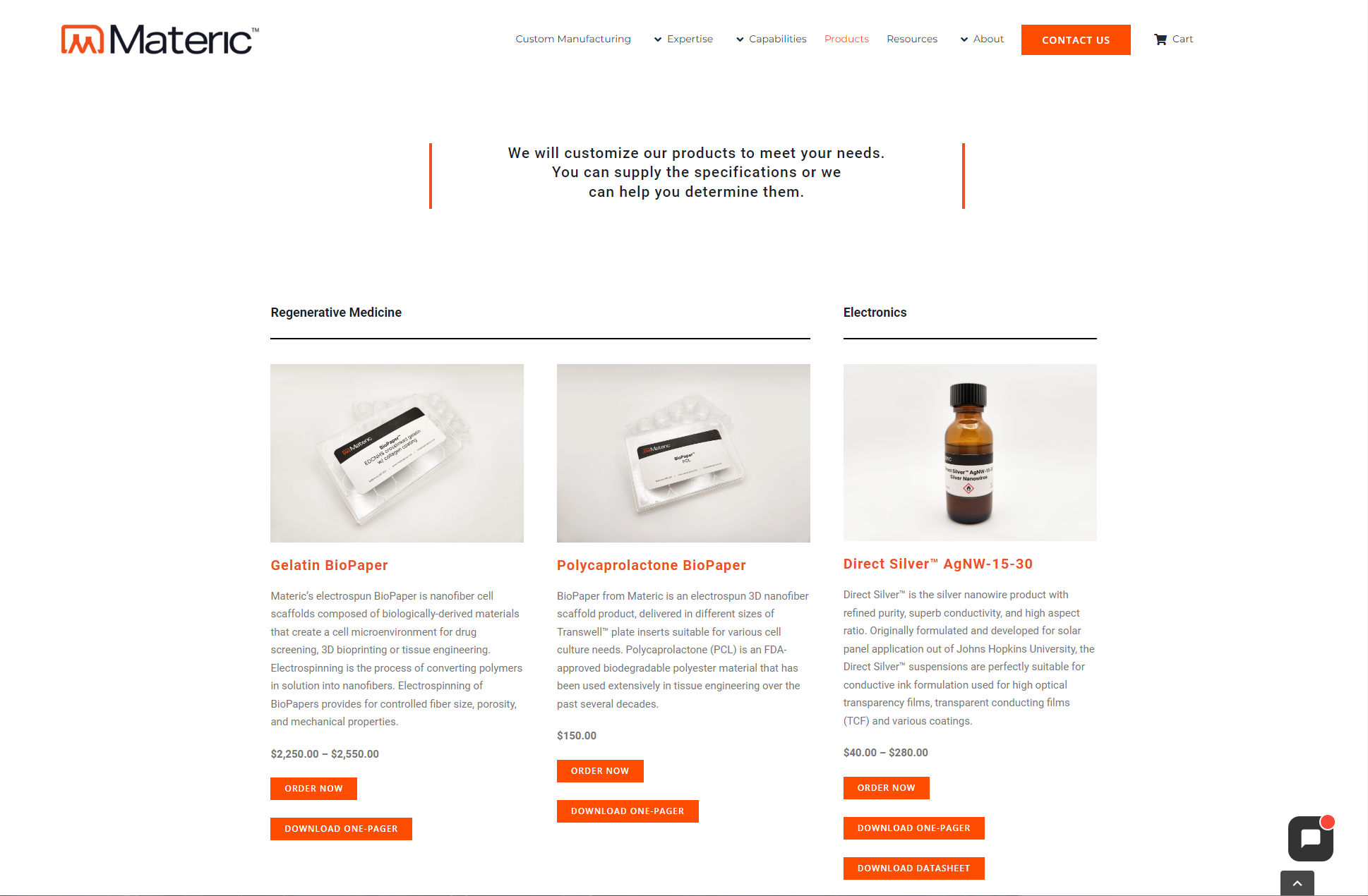
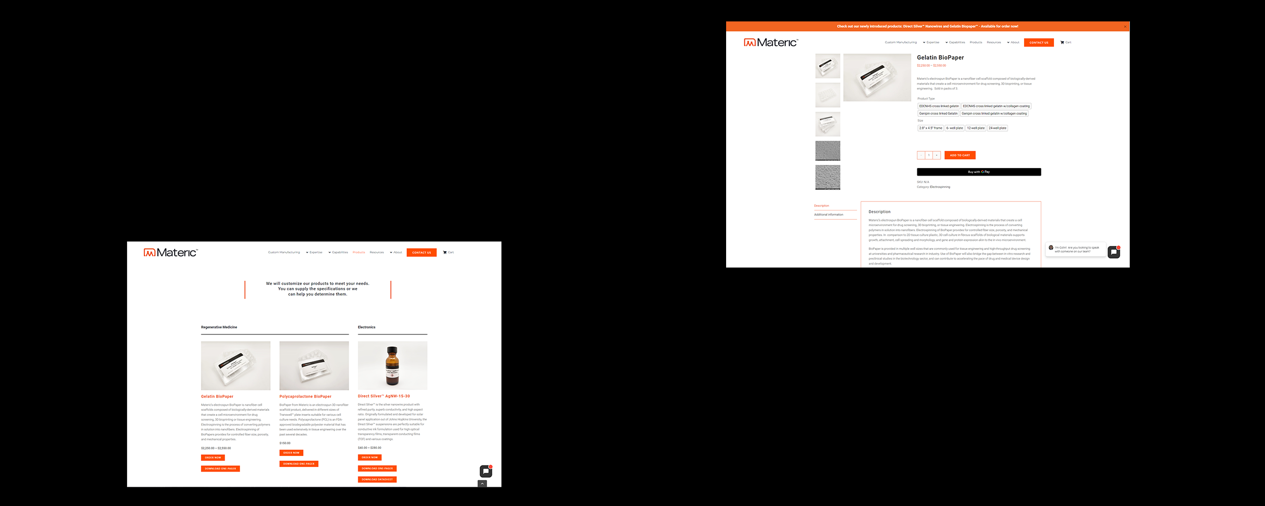
Final Designs for Product Catalogue and Product Pages
Outcome & Impact
Enabled users to evaluate and act without sales delays
Reduced friction for urgent and short-cycle buyers
Captured demand previously lost to slow turnaround times
Created a scalable digital sales foundation for future growth
Business Impact (Directional):
Improved lead quality by aligning with user intent
Reduced early-stage sales dependency
Positioned Materic for modern B2B purchasing behavior
(Post-launch metrics were tracked internally.)
Final Designs for Product Catalogue and Product Pages
What This Case Study Demonstrates
Strategic use of user research to justify business change
Strong product judgment under constraints
Ownership of a complex 0→1 system
Ability to translate technical products into usable experiences
Collaboration with engineers and commercial stakeholders to balance feasibility, clarity, and business goals
Why This Matters
This project shows how UX can remove friction not by simplifying the product—but by respecting the user’s urgency, intelligence, and context. The result was a system that served both users and the business without compromise.